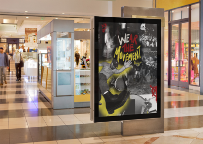
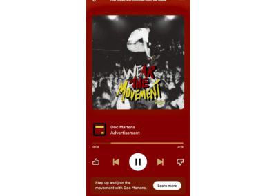
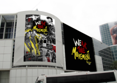
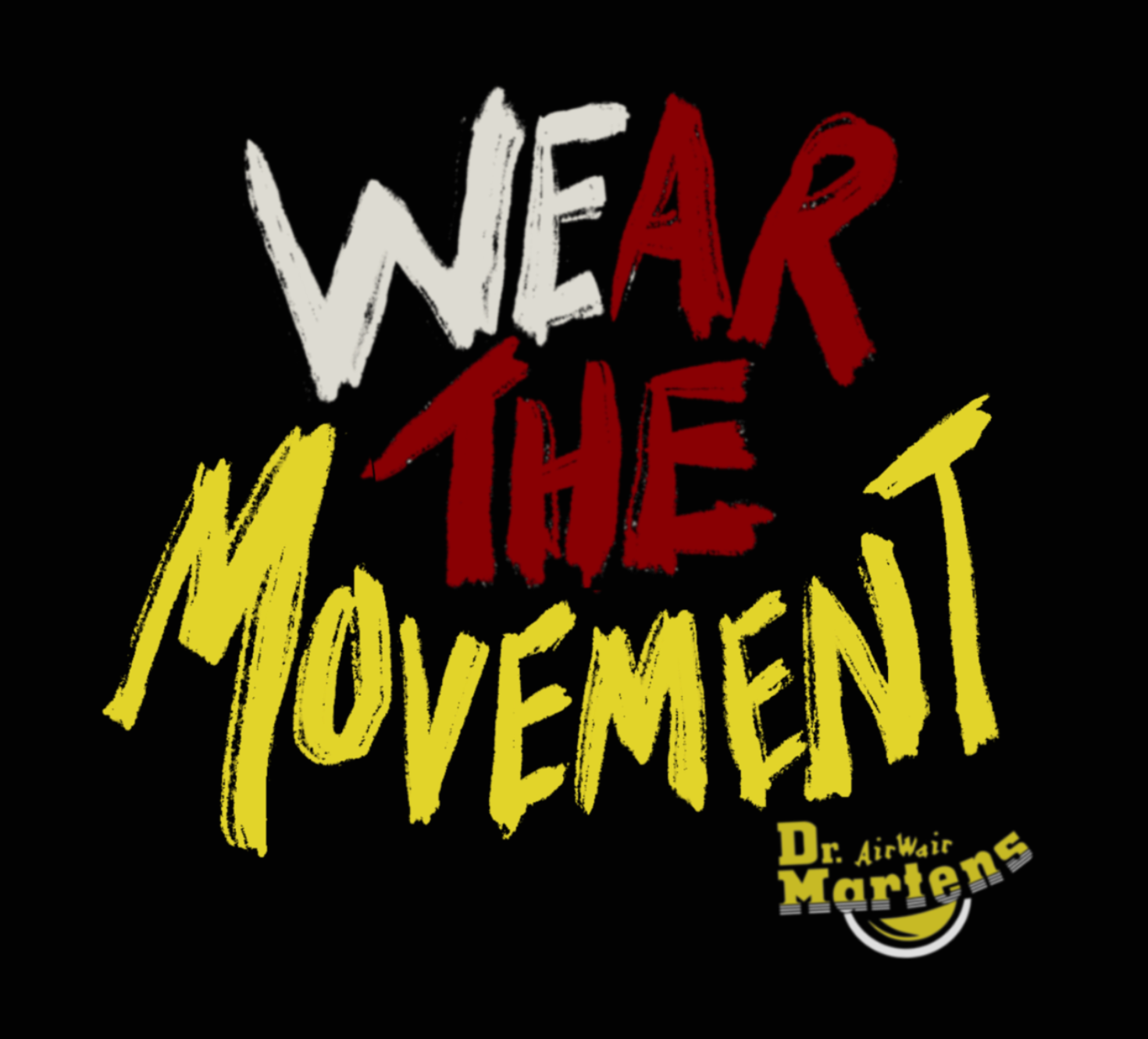
The “Wear the Movement” campaign logo for Doc Martens is designed to capture the essence of rebellion and individuality inherent in the brand’s punk legacy. The visual language embraces a bold, DIY aesthetic, with distressed textures, jagged lines, and hand drawn elements that evoke the raw energy of street graffiti. The typography is rugged and unapologetic, embodying the defiance and authenticity central to Doc Martens’
identity. The color palette leans heavily on black, yellow, and red for stark contrast, creating a striking, instantly recognizable design.
The campaign is broken down into three distinct themes: punk DIY culture, mosh pits and concert culture, and graffiti and protest culture. Each theme reflects a vital aspect of the punk community, showcasing the diverse and vibrant ways the movement expresses itself.
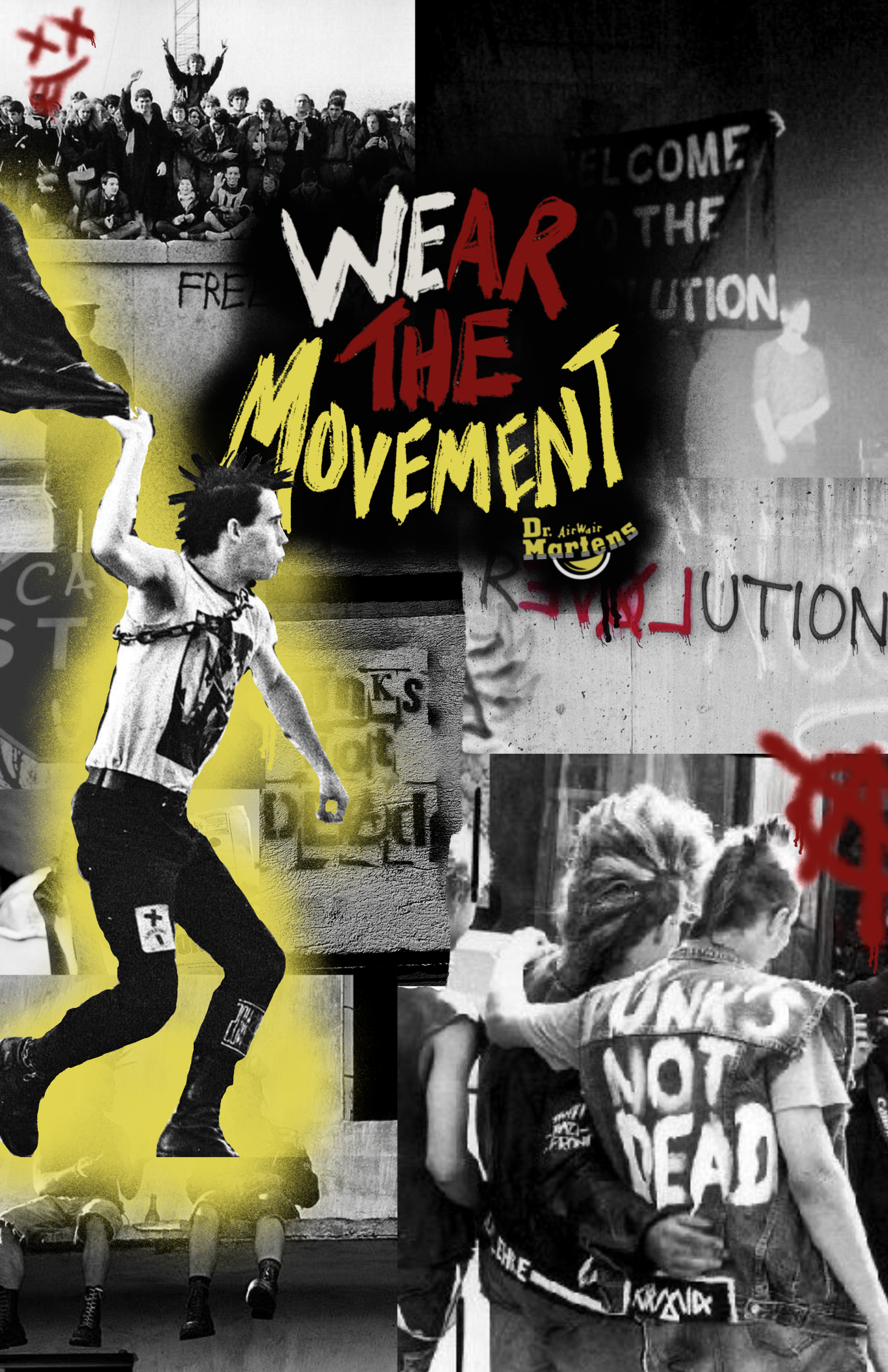
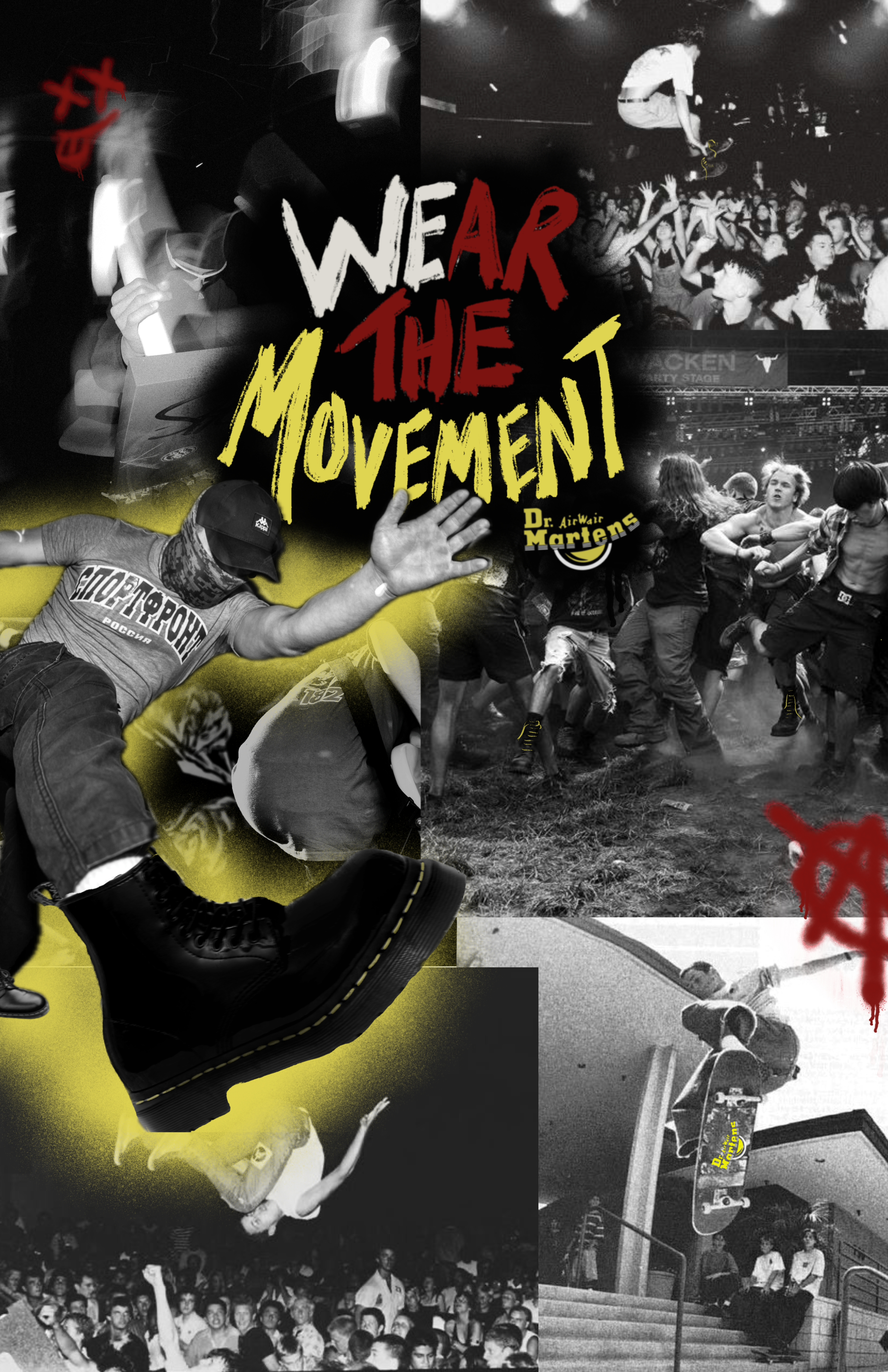
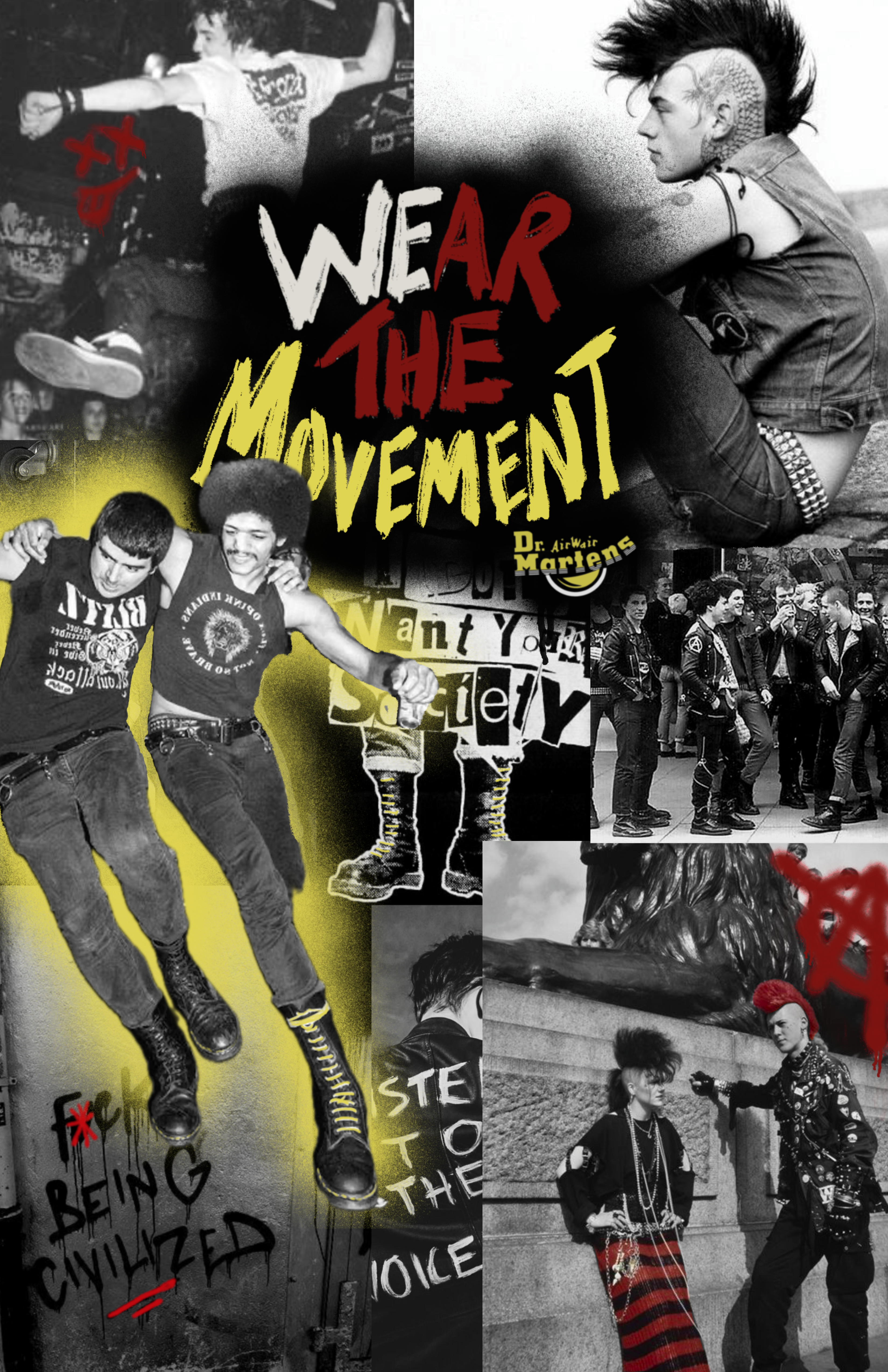
Together, these elements go beyond just aesthetics to highlight punk as a lifestyle and a united community of individuals who live authentically, rebel against conformity, and celebrate their shared values through action, art, and music. The campaign captures how Doc Martens empowers wearers to “Wear the Movement” and embody the spirit of punk every step of the way.

